
Saturday, 14 May 2016
IMPROVED Double Page Spread
IMPROVED Contents Page

I made it so the title of the Ouroboros article is clearer because it was harder to read be read earlier
IMPROVED Front Cover

I changed the colour of the Ouroboros font so it is a bit brighter. This is so it can catch the readers eye from afar.
Monday, 2 May 2016
Evaluation 7: Looking Back at Your Preliminary Task, What do You Feel You Have Learnt in the Progression From it to the Full Product?
Since the beginning of the course, I have been constantly improving on my creativity skills and my Photoshop/InDesign skills. Although I may not have stuck to my plan, I did get the job done which was to make a professional looking front cover, contents page and double page spread.
Although the preliminary task was short and only required me to make two out of the three pages I did in my main task, it gave me the foundation to make the magazine I have made now as it allowed me to dabble around with the InDesign software (which I had not used before) and it has allowed me to learn the new skill of typography,
Below is comparison between the two tasks I have done. It will be talking about the two finished products and how I have improved since then.
Evaluation 6: What Have You Learnt About Technologies From the Process of Constructing this Product?
During the process of me taking photos and manipulating them to they can fit the conventions of a metal magazine, I came across multiple forms of technology along the way. These forms of technologies have helped me create a better product in the end and it wouldn’t have been this good without them.
During the photography stage, I used a DSLR Nikon camera that was supplied to me by the school I have enrolled in. I used this camera to take the photos for my magazine. Accompanied by the camera were multiple lighting equipment that has been set up. Some of the equipment was built into the ceiling controlled by a mix board and some of the equipment were portable and easy to setup. This would’ve been my first time using professional lighting equipment as I have never had to use them in life before. I however have used a DSLR camera but to only take simple photos, I’ve never used any colour correction or special settings to make the photos come out fantastic. This was my only drawback throughout that whole session since I knew how to set up the lighting because I had some help from a few of my colleagues who have had experience with the lighting equipment.
In the end I am pretty happy with the outcome of the photos as they looked great and lighting complimented some of my models. One thing I would like to do next time is to learn how to use the DSLR properly so I can take advantage of all it has to offer because I am sure if I knew my way around a DSLR camera, my photos would’ve looked a lot better.
During the construction of my pages I used 3 different types of software. Open Broadcaster Software, OBS for short, to record my speedwork videos which has allowed me to show different types of technologies while making my media product, Adobe Photoshop, which has allowed me to manipulate the photos into how I would like them to look and Adobe InDesign which allowed me to make my typography just the way I want it to look. All of these technologies have helped me make the music magazine I envisioned at the begging of the task.
Previous to the task, I’ve had 3 years of experience with Adobe Photoshop, which made editing the photo a walk in the park for me. I used many different types of filters and I downloaded many different textures to make my photos gritty, dirty and sinister. Since I didn’t know how to use the colour correction tool on the camera, I used the colour correction tool in Photoshop which allowed me to visually change the colours and how rich they should be. I then used the Black/White tool and made my photos black and white with a small hint of blue as blue is the main colour of this particular issue of the magazine. I then later found a website that would allow me to download grungy brushes to add to my brush collection on Photoshop, this helped me give the effect that the magazine has been worn and ripped which goes with the conventions of a metal magazine.
When creating the masthead and logo of the magazine, I published a survey asking what the people would think a good metal magazine name would be. The people responded that Hexagram would be a suitable name, I agreed. To get the font I wanted, I went to a website called DaFont which has a collection of fonts that users make and post online, this is a good example of web 2.0. Once I found the collection of fonts I would like to use in my magazine, I got started on the masthead which simply says ‘Hexagram’. The font I used for the masthead is called ‘Manhunter’. I then wanted to make the logo of my magazine. Since the name of the magazine is called Hexagram, it would be fitting if I got a hexagram to be my logo. Once I found the hexagram I wanted, I put it into Photoshop and made it look scratched up so it can fit with the ‘Hexagram’ font. These skills I’ve previously learnt from just watching YouTube tutorials when I was 13 to pass the time. I have now developed these skills so they can aid me with my school work. If it wasn’t for photo manipulation software such as Photoshop, it would’ve made the magazine industry less creative with their front covers and photos as it would be a lot harder to make photos look nice.
To present my work, I use Blogger (which is the website used right now so you can read this), Prezi, Slideshare and YouTube. These websites help me publish my work and creativity online so it can be marked and graded. I use Prezi whenever I want to make a flashy looking presentation and I use slideshare whenever I want to put in a lot of information into my presentations. I use Microsoft PowerPoint to make my presentation then upload it to slideshare. I also use YouTube whenever I want to upload a video showing how I made documents, this would’ve saved me a lot of time instead of typing out how I manipulated my photos as you can visually see it for yourself.
Finally, I use Google Forms for you surveys. The surveys help me with my research into making a better magazine for my readers. Google Forms collates all of the responses and puts them into charts which makes my life a lot easier when evaluating my responses. All of these technologies have helped me make the media product for this task.
Evaluation 4: Who Would be the Audience for your Media Product?
Through my research, it has made it clear to me who my main target audience would be as they have answered my previous surveys answering questions such as 'Where are you from' and 'How old are you?'. The answers to these questions have made it easier for me to decided on the type of language the magazine will use and the look of the magazine as I will want it to appeal to a certain age group.
Geographic:
My magazine would appeal to a more western audience, specifically the UK. However, consumers from the US, some Scandinavian countries (Sweden/Norway) and Australia may also be interested in my magazine. I have chosen to prioritize the UK as my primary audience due to the lack of a niche metal magazine in the UK. This has made UK metal fans feel unrepresented, as most metal magazines cover festivals and tours in the US, whereas the UK generally gets ignored. My end goal is to have a metal festival like “Hammerfest” which is sponsored by the “Metal Hammer” magazine. This will be utilizing cross media convergence and will help to make metal fans in the UK feel more represented and will help to bring metal music into less of a “niche” market and more of a mainstream market and help to bring in more “aspirers” into the genre.
Demographic:
My magazine would appeal more to people in their late teens to their mid-30s (around 16-35/6) who are in C1/C2/D on the registrar scale. However, as metal is a very niche genre, this may not be entirely accurate. It also has a bigger ratio of males to females, as females stereotypically like mainstream music more than metal. This trend is backed up by my survey results. Although - as stated previously - due to metal being a niche genre, this may not stand true in some cases. Stereotypically, my magazine would appeal more towards people who are part of the “Emo” or “Goth” groups.
Psychographic:
Currently, the main psychographic profile for metal music fans are “individualists/quirkies” this is because metal isn’t considered a mainstream style of music due to the fact that most types of people would prefer to listen to “radio” music - generally rap, pop and RnB music produced by mainstream artists such as Rihanna, Beyoncé, Drake and Eminem. Music of those genres generally stand out to” aspirers” and “mainstreamers” because these are usually on national radio which is an easily accessible form of media as it is readily available in most cars, as well as popular shopping centres, restaurants and retail stores. It would be considered odd or out of the ordinary if music from a metal band such as “Gojira” were to be played in these areas.
Evaluation 2: How does your Media Product Represent Particular Social Groups?
When designing my magazine, I used colours and “tropes” commonly used by metal bands to make themselves look “hardcore” and “brutal”. The band I created for the purpose of my media product, known as “Ouroboros” emulated those conventions through mise-en-scène.
 I dressed the bassist of the band in black and placed a gas mask on his head. Gas masks are symbolic of suffering as they were used to combat chemical weapons that were used in the first world war. If a gas mask was not worn, some of the chemical weapons would cause blisters in the lungs and on any exposed skin, leading to a very painful death. This helps show the band off as “brutal”. I placed white tape on the gas mask’s front, as well as on the bass guitar to contrast the black and to help him “pop” out to the audience. The bassist holds the persona of the quiet, creative member of the band, as he also plays the bass - which is representative of his personality- quiet, but essential. This shows off one type of metal fans, people belonging to the “goth” scene who are generally quiet, but also stand out in a crowd. They are loud in their own way.
To further push these conventions I dressed the lead of the band in a choker, a leather jacket, black jeans and a white t-shirt with a reference to the cuban ‘revolución’ that was headed up by Che Guevara and Fidel Castro which helped to free cuba from american leadership. This gives a message that the band is ‘revolutionary’ or ‘unique’ as there is a female lead who is also the lead guitarist, something that is uncommon in the world of metal. She wants change in the world of metal, so her dress style does not fit in with any metal stereotypes but still follows the codes and conventions set. She represents female metal fans, trying to change things up and helping females get a more prevalent role in metal, rather than the “groupies” that they are commonly represented as in films and in popular culture.
 The drummer is going for a slightly more sophisticated look that most modern metal bands use, while keeping with the codes and conventions of the metal genre. He is wearing a Death t-shirt from the band of the same name which has a scythe as the ‘t’ in the word death. The scythe represents the grim reaper, or more specifically the Greek god of death “Thanatos”. Thanatos was commonly depicted to be using a scythe to reap the souls of the dead into the underworld, just as a farmer would reap crops. The drummers attire shows that he - while looking casual - still maintains the “brutal” codes and conventions of metal. He represents a conformed side of metal, people who don’t want their appearance to stand out due to professional reasons -they may hold a C1 job position so may not be allowed to have heavy piercings or tattoos like most stereotypical “metal heads”- but still want to show that they are fans of the genre. You could describe them as “closet” metal fans.
All three of the members of this band fit with different eras and subgenres of metal - the bassist fitting in with the 1995/6 thrash metal scene, which was the prevalent form of metal at the time. The singer/guitarist fits in with early 2000’s gothic rock scene, however, as the drummer fits more with the modern metal scene from around 2007/8 this is due to the fact this his attire, which was made popular around the same time is more casual compared to the “brutal” look of the bassist and the more “gothic” look of the lead singer.
Sunday, 1 May 2016
Tuesday, 26 April 2016


Thursday, 21 April 2016


Tuesday, 19 April 2016
Reference for my Double Page Spread
As of now I am working on my double page spread but the dimensions are different to just adding two A4 pages. This is because there is some places you should avoid such as the central marginal area which is basically the middle area of the magazine that can't be seen.


Sunday, 17 April 2016
My First Contents Page
This is my first attempt at making my proper contents page. In my opinions it looks unique and conventional at the same time. I made the background a zoomed in image of one of the photos of my model that I took by accident with a few filters and textures to make it look dark and gritty which goes with the conventions of a metal magazine. I kept to the colour scheme and I have also highlighted the main article which is about the band on the front cover (Ouroboros). Later I will quickly edit the recordings I took while making the contents page then I will get my friend to review it. I will upload this sometime in the near future.


Saturday, 16 April 2016
A Quick Thing I Threw Together as an Idea
I did this just to see how it would look and to test if my skills are good enough to pull this off but I tried to make it so one of the band members is in my school yearbook dressed in his costume with his name scratched off. This is to make his character mysterious and to make it look like he's the weird one of the group. I'm thinking of using this as either a contents page or a DPS, but I'm leaning more towards a DPS.


My First Front Cover
This is my first attempt at my front cover for the magazine. I think it looks pretty good and the text fills the magazine cover so it doesn't look empty. I've taken a lot of influence from Metal Hammer to make the cover and I've added my own ideas to make it look like not a complete copy. I've also recorded me starting this from scratch, I just have to edit the video and speed it up then I will upload it. I will also ask a few people to see what they think I should add or if they like it how it is.

Friday, 15 April 2016
Process of Photography
 |
| One of my models trying on his outfit that I picked out for him. |
 |
| I had to add black paint around my models eyes as his skin colour can clearly be seen through glass, this will make my job easier in post production. |
 |
| Even though we can sort of see his skin colour, it will be easier to edit that out in post compared to before. |
 |
| The costume for the bassist |
 |
| The costume for the guitarist |
 |
| The costume for the singer |
 |
| Setting up the lights so I can get a clearer picture |
 |
| Picture of me fiddling with the white balance on the camera |
 |
| Models getting ready to get their photos taken |
 |
 +
+


Thursday, 14 April 2016
Double Page Spread Copy Mockup 2
This is my second mockup of the dps copy that I will be putting in my final product. I'm going to publish a survey asking which style they prefer and I will send them the mocks as examples.


Double Page Spread Copy Mockup 1
This is my first go at a Double Page Spread. For this mockup I decided to go for more of a Q&A rather than just the band talking about one subject. In my next mockup I'm going to take a different approach at my double page spread. Once I'm done with both I'm going to ask my peers what they think is better and I will use that as my final double page spread copy.


Tuesday, 15 March 2016

Wednesday, 9 March 2016
Photoshoot planning
Plans for
Photoshoot
For my photoshoot I’m planning to use a male model and dress
him up to look very aggressive and look like a stereotypical band member. I am
planning to use some make-up to make my model look pale and dirty and I'm also planning to give my model a wig as long hair is the most stereotypical ‘metal head’ hairstyle.
Depending
on the circumstances I may not be able to use makeup in case I don’t access to
them so I will compromise with buying a horror mask or any other sort of mask and
making my model wear it instead. I'm to go for more a Slipknot look for my
front cover since their style is more iconic as it can be easily distinguished
between metal and rock unlike some other metal bands. I will give my model a
bass guitar or a pair of black drum sticks as the colour black is associated
with the metal genre and I will also ask my model to wear an all-black attire
as the colour black is associated with the metal genre.
I'm planning for my model
to either wear a black fleece, black shirt or a black t-shirt with black
trousers and boots (or similar). This will of course depend on my
model as he may not have these things so I will have to compromise with what I will have to work with.
 |
I’m planning for my model to wear this gas mask as it will
look pretty freaky with the lighting and it will go very well with the attire
the model will be wearing. I am also thinking about getting white masking tape
and taping some parts for it to look damaged.
 
I will settle for similar shoes to these as they go well with
the metal style and it will still look in fashion with modern metal.
  
I want my model to wear either one of these tops in the shoot
as it will fit my metal style. These will go well with the boots and the gas
mask.
 
And finally I would like my model to wear either black cargo
pants or black straight jeans as they will go very well with the top and the
boots.
|
Sunday, 7 February 2016

Friday, 5 February 2016
Magazine DPS House Style First Draft
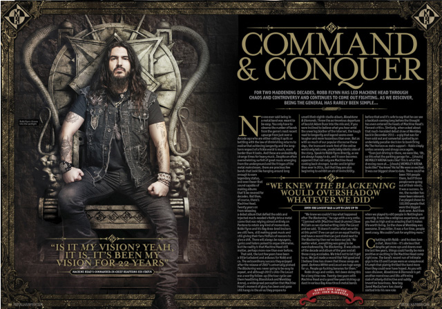
This is my first take on making my DPS house style. As you can see, I've used the same band that is used on the front cover, this is because I made the front cover to boost this article so more people can look forward to reading it. In my opinion, the double page spread looks good but there are a few flaws such as the columns aren't evenly spread out which may annoy some people and another flaw is the bottom right of the pages, as you can see on all of the corners there is a graphic of either a hexagram or a snake, but on the bottom right there isn't any, this also my annoy some people. This layout fits the metal magazine conventions as Metal Hammer has a similar house style to this mock up I have just made. This was heavily influenced by the Machine Head Metal Hammer article that I have posted below my mockup.


Thursday, 4 February 2016
Magazine house style first draft
This is my first take on making my magazine house style. As you can see. I've used the name that was most popular in my previous survey. I have also taken the advice I have been given from my first survey. I think it turned out great and I will use a big portion of this house style in my final draft of the magazine cover.


Magazine Name Survey Evaluation
I recently posted a survey for my magazine name asking my participants to pick a fitting name for a metal magazine. I gave the options that I thought sounded pretty good but I also gave the option for the participants to write one themselves. I didn't get much results back but luckily for me, most of the results were one of the options I had written, this makes it easier for me to decided on pickling a name.

From the results it looks like Hexagram was a more fitting name, so I will be using this as my magazine name unless I think of a better one, in which case I will post another survey asking what other names participants find better and more fitting.
From the results it looks like Hexagram was a more fitting name, so I will be using this as my magazine name unless I think of a better one, in which case I will post another survey asking what other names participants find better and more fitting.
Survey for a magazine name
I am now deciding on a magazine name, I have posted a survey asking what good names would be fitting on a metal magazine. I have written a few of my own suggestions but I have also left an 'other' section in case some of the participants have an idea of a better name.
Survey link: https://docs.google.com/forms/d/13cgCrADGW4txzC8LZVTLcG6EFKa3DrnkEvJDz2LYhEM/edit
Survey link: https://docs.google.com/forms/d/13cgCrADGW4txzC8LZVTLcG6EFKa3DrnkEvJDz2LYhEM/edit
Criteria Grid
|
Criteria
|
Must have?
|
Could have?
|
Where seen
|
How I will use it
|
Intended impact
|
|
House Style
|
|
|
All magazines
|
Through the research I have done, I have realised that every big
magazine has a certain house style they stick to. This helps the audience
identify the magazines since they would be used to seeing the house style in
the same format the magazine has used multiple times.
|
Doing this will get my audience to associate my house style with my
magazine only. This will give the impression that my magazine is professional
as it sticks to its house style and doesn’t change to confuse my audience.
|
|
Masthead
|
|
|
All magazines
|
My masthead will always be on the top since that is the conventional
place to place a masthead from what I’ve seen through my research in metal
magazines.
|
My masthead will contain the name of my magazine. I intend to catch
the customers eye with a catchy font and a name that is short and sweet since
names like these usually stick in the customer’s head.
|
|
Centre of visual interest (CVI)
|
|
|
All magazines
|
From my research, all of the magazines have a CVI, whether it’s a
celebrity, band etc. This means that it is a very conventional thing to have
in a magazine, especially a music magazine since customers could be attracted
to the magazines if they see their favourite artist/band.
|
This will impact the customer in a big way since the CVI will give
the customer a snippet of what is to come in the magazine and the feel of it.
This will also attract the customer in case they see their favourite artists
on the front cover, this will influence them to buy it. I will use the CVI to
boost my double page spread.
|
|
Contents Page
|
|
|
All magazines
|
The contents page is one of the most important parts in a magazine
since it will be the second place the reader will look at, this is because
they will want to know what content the magazine has and if it will be worth
the price they will be paying.
|
Having an attractive contents page will also attract the reader to
buy the magazine since it will make them want to read a story that catches
their eye. So I will have to think of eye catching titles it lures my
customer in.
|
|
Double Page Spread
|
|
|
All magazines
|
Most if not all magazines have a double page spread in the magazines
somewhere. A double page spread looks very attractive to the customer and
will also look attractive on the magazine company since this will show the
magazine is successful enough to have a big story that requires two full
pages of content.
|
The double page spread will be what the customers are most looking
forward to in my magazine since I boosted it on my front cover and it will
probably be the main reason why they bought it. With that in mind I will have
to catch my reader’s attention with a very eye catching headline and kicker.
From this my reader will read the feature written within the double page
spread and get a good experience from the magazine.
|
|
Barcode
|
|
|
All magazines
|
All magazines have a barcode on them besides the magazines that are
free like NME, the barcodes are used at the checkout so the cashier and scan
it so the customer can pay.
|
A barcode will allow the magazine to be distributed easily since the
machines can scan the barcode and send it to the right pile. This barcode is
also used to not confuse the customer in case the product is free or not.
|
|
Cover lines
|
|
|
All magazines
|
Cover lines get the reader’s attention to a magazine since they will
have eye catching titles. Cover lines give a brief look of what the customer
will be expecting to see inside the magazine. Although, I noticed that Metal
Hammer, a metal music magazine, doesn’t use cover lines in the conventional
way, Metal Hammer instead writes the names of the bands that will be included
in the magazine, this is to catch the reader’s attention in case they see
their favourite band included.
|
I expect this to lure the customer into picking up this magazine,
from there, I expect the other features that I have mentioned above to come
into play into getting the customer to buy and read the magazine.
|
|
Colour scheme
|
|
|
All magazines
|
I will use consistent colour schemes throughout my magazine so each
page wouldn’t look out of place compared the page before.
|
This will give the reader the impression that this magazine is very
professional and it will make the user take the magazine seriously.
|
|
Captions under photos
|
|
|
All magazines
|
I will use captions to describe certain photos in the magazine in
case the reader doesn’t know what is going on in the photo.
|
This will help the reader understand the photo being captioned and it
will give them a good understanding of the article. This will improve their
experience within the magazine.
|
|
Column
|
|
|
All magazines
|
The use of columns in my magazines will give my copy a structure and
a good layout that the reader would be used to seeing since columns are used
in other magazines along with newspapers.
|
This will also give the impression that this magazine is
professionally made since the copies contained within the magazine are
perfectly structured and laid out.
|
|
Drop Cap
|
|
|
Metal Hammer, Kerrang, NME
|
I will use drop caps to begin the copy, this is to make the columns
look fancy and to intrigue the reader.
|
This will indicate the beginning of the copy and it will cause less
confusion in case a reader isn’t used to the format.
|
|
Running headline
|
|
|
Kerrang, NME
|
I will use this so I can make the most of the double page spread so
there will be no empty spaces on the pages.
|
This will give a nice impression on the reader as it will make the
article look nicer and more aesthetically pleasing.
|
|
Technical musical language
|
|
|
Metal Hammer, Kerrang
|
I will use technical musical language that musical enthusiast will
understand,
|
|
Subscribe to:
Comments (Atom)